Quick n Easy Site Refresh II
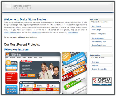
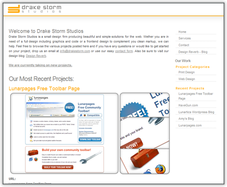
I was really getting a tired of the design for Drake Storm Studios. It seems like there is never any time to do a complete head to toe redesign. So for now another quick revamp.
The old just looked too much like a blog, and although its built off of wordpress, it’s not exactly what I was going for.

The new look is basically just a cosmetic facelift, if you will. Not much changed on the backend. Really just opened Photoshop and made some color and layout changes. I also cleaned up the logo in illustrator.
What do you think?


